BRAC - Rebranding the World’s Largest NGO.
The Brief BRAC operates across more than a dozen countries with over 100,000 employees. Its brand had evolved organically over decades — which meant inconsistency across regions, channels, and teams. The 2021/2022 rebrand was an opportunity to create a visual system that could hold together at scale without erasing the warmth and specificity that makes BRAC's work feel human.
The Work The rebrand rejects the saviour narrative that has long defined how development organizations present themselves. Instead, it centres resilience — the story of people realising their own potential, with BRAC as a partner rather than a protagonist. The stitch motif, drawn from the wheel petal, runs through the identity system as a structural and symbolic thread. The extended colour palette was drawn directly from nature, grounding the brand in the environments where BRAC works.
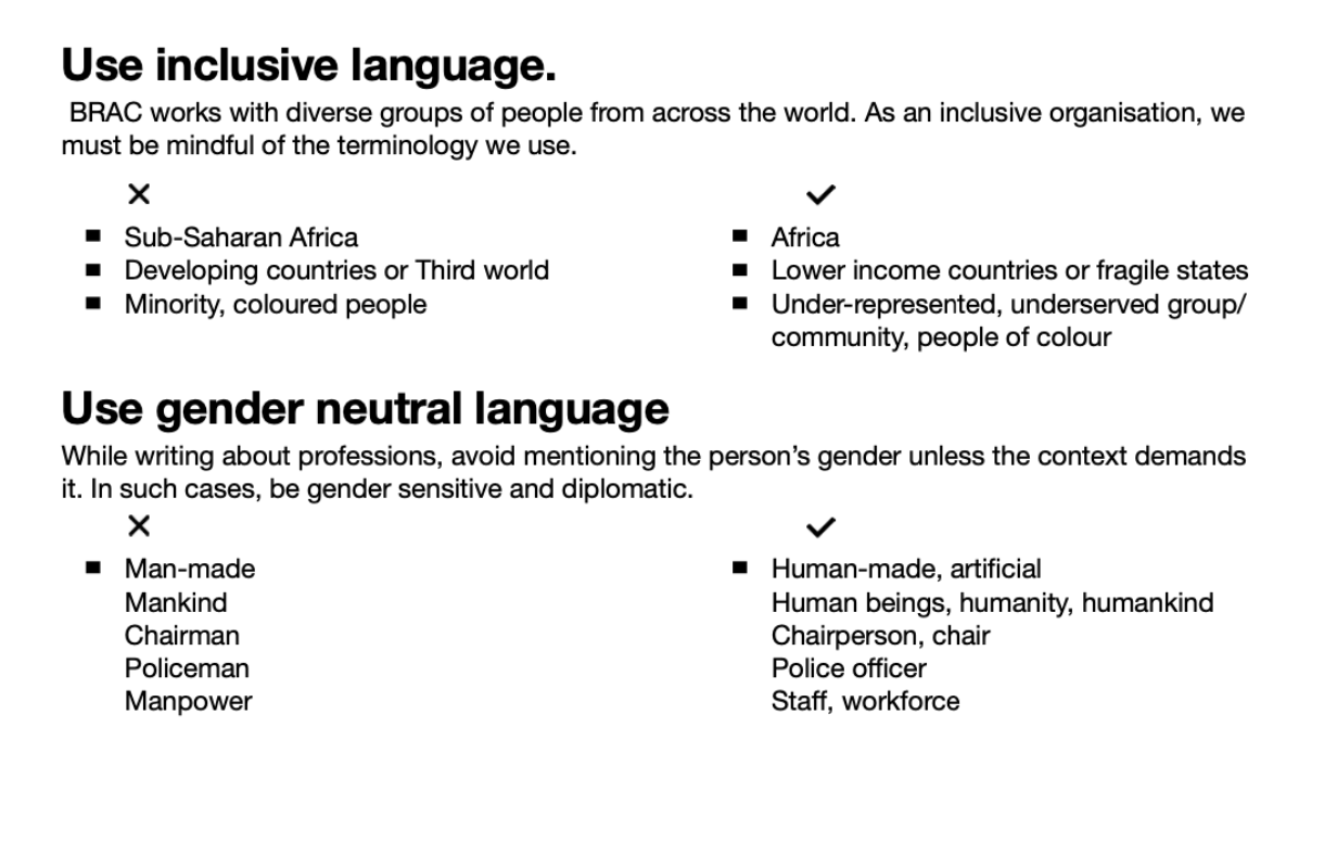
The brand book — developed in partnership with BRAC Internal Comms and M&C Saatchi — covers guidelines for designers, photographers, videographers, and content writers across all country offices. It remains the governing document for how BRAC presents itself to the world.
Role: Creative Director
Credits: Concept with Sarah-Jane Saltmarsh, Sara Afreen, Marcia Amin. Design with M&C Saatchi. Content with Sarah-Jane Saltmarsh, Sameeha Suraiya.
Deliverables: Brand identity system, extended colour palette, stitch motif, brand book, communication guidelines


BRAC makes sure of using context specific and sensitive communication to highlight people as heroes in their story.
The newer addition to BRAC's secondary colours (the last two columns on the bottom right) have been extracted from nature itself.
The brand book includes specific guidelines for all forms of communication - for designers, photographers, videographers, and content writers. Several guidelines and the creation of the holistic book has been carried out by Rubab, BRAC Internal Comms, and M&C Saatchi in unison.


